Instagram changes its text logo for the first time in a decade – and the socials are going wild
Some fans love the refresh, while others say the new logo reads “InstagZam” – or shall we say, InstagZam-ic?
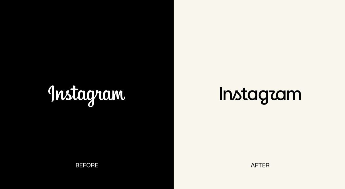
Image by Instagram

 Follow us
- Instagram has refreshed its familiar text logo for the first time in 10 years.
- Some users love the cleaner look – others say the new lettering is difficult to read.
- The redesign has sparked jokes that Instagram’s name now looks more like “Instagzam.”
Instagram has changed its familiar lettering for the first time in a decade, replacing the cursive-style logo in what the company is calling a "modern" take on an entirely new branding system for the social platform.
And while the change may seem subtle, Instagram users definitely have opinions. Even ChatGPT got in on the action, joining the tens of thousands weighing in on the new look.
Head of Instagram Adam Mosseri posted the redesign to his 4 million followers Thursday.
“The wordmark at the top of the app hasn’t changed in 10 years, so it was time for a refresh.”Mosseri captioned the post.






The 43-year-old father of 3 described the fresh facade: “Cleaner and more modern, with references to the original.”
Mosseri also claimed that the new lettering design has “the simplicity and craft that’s always made it Instagram.”
Instagram gets a fresh look
The redesigned wordmark – essentially Instagram’s written logo – is part of a broader refresh of the social media platform’s brand identity.
According to Meta, designers explored hundreds of possibilities before landing on the final version, “from all-caps, to camera concepts, to literal handwriting.”
“We kept coming back to what’s always been special about Instagram: the magic of crafted script. It modernizes the brand while keeping that warmth – our hope is that it feels personal, confident, and unique,” Meta said in a blog post announcing the changes.

Meanwhile, the IG overhaul includes both subtle and bolder updates across the platform to reflect the new "expressive" brand system:
- Gradient – stays familiar, but will be used more subtly.
- Motion, layout, and UI – refreshed across the platform.
- Instagram Sans – an updated version of the existing typeface.
- Instagram Pen – a new handwriting typeface.
- Instagram Mono – a new monospaced font.
From Instagram to "InstagZam"?
May Hartono, Director of Brand Design at Meta, says the new designs are meant to spark courageous action and "give people the confidence to create and show up as themselves, freely and fully."
And obviously inspired by the message, they certainly did so – in the comments section, as expected.
"Beautiful! Love,” one commenter immediately embraced the look. Another described the redesign as “modern and clean but fun too.”
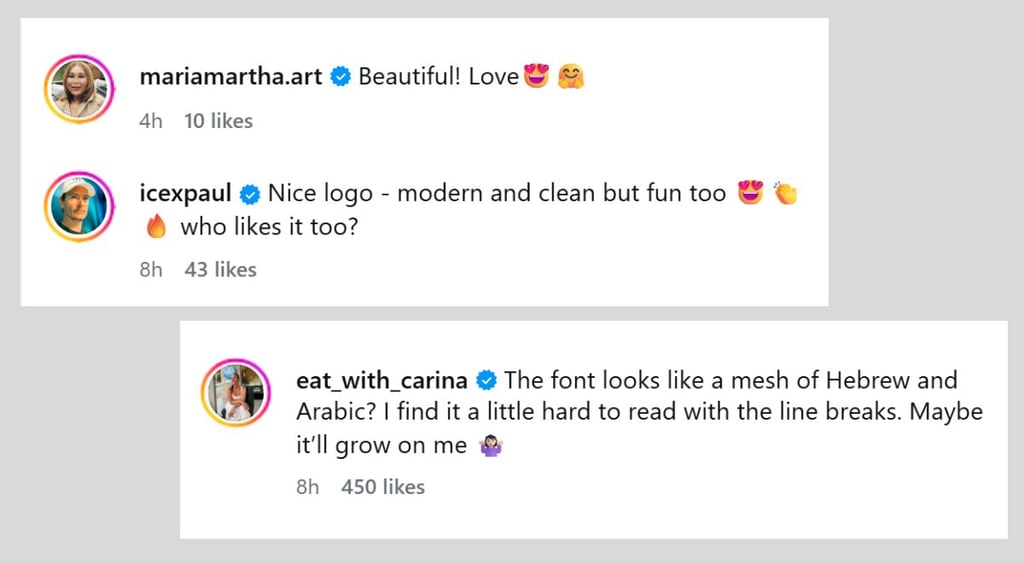
But then people started actually trying to read it – and one theme clearly began to emerge.
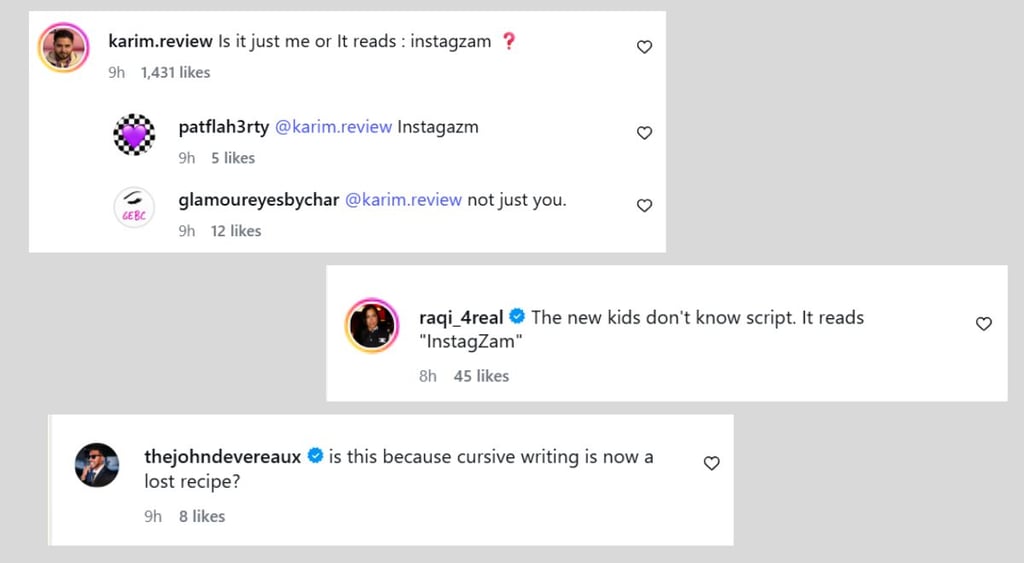
“Is it just me or It reads : instagzam ❓” a user asked, prompting others to agree.
“The new kids don't know script. It reads ‘InstagZam’,”another commenter wrote, making a very Gen Z observation.
That sparked another back and forth about why cursive was used for the redsign. “Is this because cursive writing is now a lost recipe?” one Instgram user asked.
Of course, Instagram’s previous wordmark was also written in a cursive-style script, so whether younger users suddenly forgot how to read Instagram remains up for debate.
It appears even ChatGPT itself – or its handlers – had something to say about the new look.
The OpenAI chatbot’s official Instagram account posted this late Thursday night, gaining more than 300,000 likes and 7,300 comments for the cheeky swipe at the Meta-owned platform.
Using the same cursive font and background color, the AI unveiled its own new logo, spelling out ChatGPT as “chatjipti.”
“Well played,” one Instagram user responded, summing up the consensus.
Not everyone is sold
Of course, you can never make everyone happy.
Some commenters were focused less on what the new logo appeared to say and more on whether the new design itself actually works.
One person thought the revamped lettering was difficult to read, although they acknowledged that it “might grow on me.”
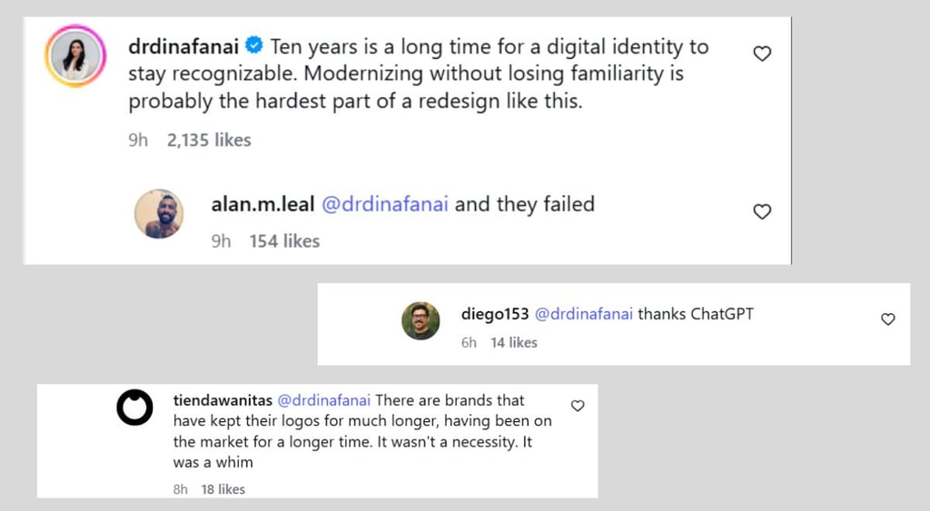
Another commenter, citing brand longevity, said the change “wasn't a necessity. It was a whim,” while another user declared “Thanks, ChatGPT,” obviously unimpressed with the workmanship.
Offering a more detailed defense, this commenter described the changes as an attempt to make Instagram feel “more contemporary and fluid while preserving brand recognition.”
The response underneath being considerably less diplomatic, simply stating, “and they failed.”
Instagram says the newly refreshed wordmark is now rolling out globally, with the full brand identity set to follow through 2026 and beyond.



Stay updated with our latest stories and follow us on social media
Be the first to discover new stories, ideas, and updates from our team.