Apple Music ditches iconic red logo, and users are not having it
Music redesign hits a flat note.
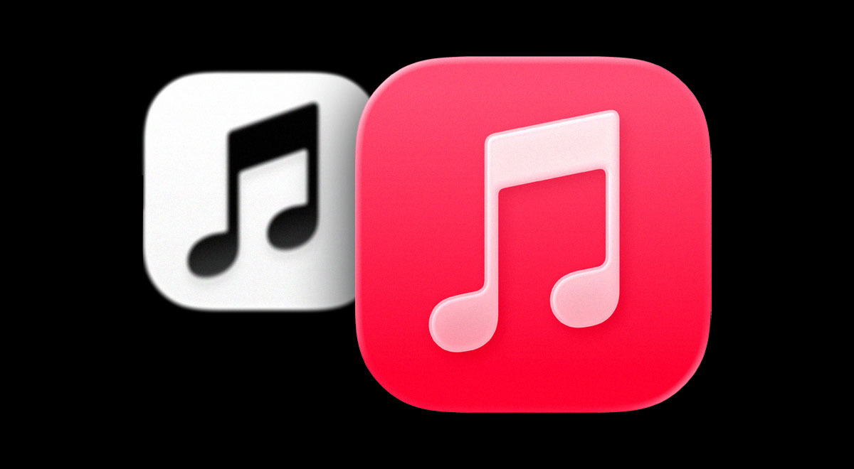
Apple Music logo change. Image by Cybernews.

 Follow us
- Apple is testing a black-and-white Apple Music logo in an upcoming iOS 27.2 update.
- The design removes the familiar red background and slightly reshapes the musical note.
- Social media users largely criticized the change, though some said black and white fits sheet music.
- The red Apple Music branding has been a key part of the app for 13 years.
Key Takeaways by nexos.ai, reviewed by Cybernews staff.
Apple Music looks set to replace its signature red musical note logo with a minimalist black-and-white design, sparking a mixed reaction on social media.
The new black-and-white Apple Music logo has appeared in a test version of Apple's upcoming iOS 27.2 software update, suggesting that the company could soon replace the familiar red icon on iPhones.
Independent designer Andreas Storm posted on X the testing version of the new logo which swaps the familiar red background and white musical note for a monochrome treatment, with a reverse white-on-black version appearing in dark mode.
Apple have subtly altered the musical note in the logo too, tilting it further to the left, as well as reshaping the bottom of the notes to more oval forms.





The tech company is also introducing a “clear” version of the logo, which can be tinted in different colors, with Storm posting 4 different treatments.
Apple has updated the Apple Music app icon in beta 4 https://t.co/hcx1fknpGr
undefined Andreas Storm (@avstorm) October 13, 2026
The red aspect of Apple's musical note has been a defining feature of the company's branding for 13 years.
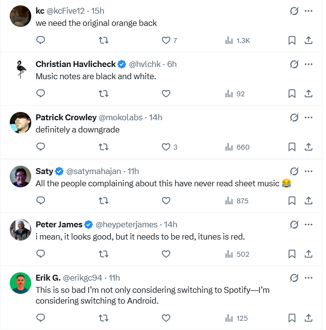
The reaction to Storm’s post on X was wide-ranging, with the designs causing a stir in the community.
One commenter called for the original orange version back, which was in operation from 2011 to 2013, as another pointed out the fact that sheet music is in fact black and white.
Some users argued that red is the best fit, as it is the default color of music streaming platform iTunes, while others said they’d consider switching to Spotify or even Android operating system as a result.
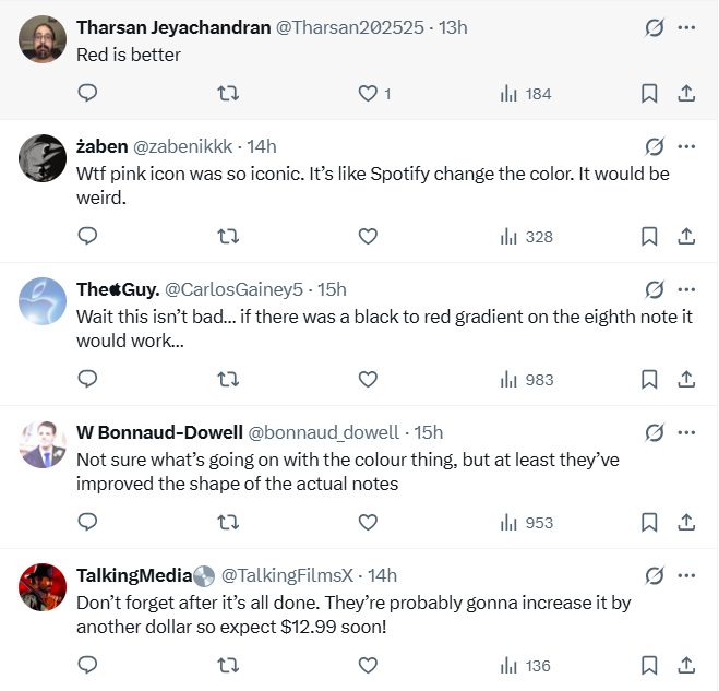
On top of that, others unpacked the design intricacies, with most showing disapproval of the color change.
One respondent in particular noted the overarching change could be increased subscription fees.
Logo changes often cause a stir, particularly in the tech community. In August, Instagram changed its logo to a different font, causing a massive stir.
And in May 2025, Google tweaked its logo for the first time in a decade, making the change so subtle that most people barely even noticed.